Subscribe to Our Newsletter
The Mind’s Eye

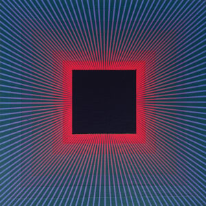
Richard Anuszkiewicz, Dynamic Blue Eclipse, acrylic on wood panel, 18 x 18 in.
Courtesy of The Estate of Richard Anuszkiewicz © 2021 The Estate of Richard Anuszkiewicz. All Rights Reserved. Licensed by Artists Rights Society, New York, NY at arsny.com
The late Richard Anuszkiewicz’s work is a rigorous yet joyous exploration of the realm of pure color and form.
By John Dorfman
The term “Op Art” was invented by a critic, not an artist, and the movement to which it was applied—if movement it was—came and went within a span of about five years in the mid- to late 1960s. But the work of Richard Anuszkiewicz, who was hailed as one of Op’s two greatest practitioners, lives on, a unique contribution to abstract art and to our understanding of the way color affects the human eye, mind, and spirit.
Anuszkiewicz’s paintings and prints are instantly recognizable for their bold contrasts between complementary colors, their geometrically rigorous organization, and their intricate use of fine lines. To 21st-century eyes, they look as if they could have been made with computer software, but in fact they are hand-made, every inch of the way. Acrylic paint was applied to the canvas or Masonite with brushes, and the fine lines were created in stencil fashion, by using a very narrow gauge of masking tape called charting tape. In contrast to the Abstract Expressionists, Anuszkiewicz sought to eliminate the gestural touch from his paintings, to create absolutely smooth surfaces and perfectly straight lines. He did this not to appear deliberately mechanistic but because he wanted to express something beyond the personality and emotions of the artist. He strove for the truly abstract, the impersonal, even the eternal.
In 1970, an interviewer said to him, “Your things look as if they’d been turned out by a machine. The perfection is so extraordinary. Perhaps you feel that a work of art should look as if the human hand hasn’t touched it.” Anuszkiewicz replied, “I really don’t feel that it’s the hand. I think it’s the mind that’s important here. We put too much emphasis on the hand. And the mind is something that can never be replaced. You can never create any new art unless it’s created by the human mind.” Anuszkiewicz, who had studied with Josef Albers and immersed himself in the theories of the psychologist Rudolf Arnheim (author of the 1954 book Art and Visual Perception: A Psychology of the Creative Eye), pursued a career-long project of exploring the relationship between the eye and the mind, especially as regards the effects of color. As he himself put it, “Color function becomes my subject matter, and its performance is my painting.”
Even as a budding artist, Anuszkiewicz’s basic orientation was apparent. Born in 1930 in Erie, Pa., to parents who had immigrated from Poland, he started drawing as a child, using pads of rough paper that were brought home for him by his father, who worked in a paper mill. In high school, Anuszkiewicz started formal art instruction and would spend as much as four or five hours a day drawing and painting. In 1948 he went to the Cleveland Institute of Art for five years of study, during which time he painted exclusively in a realist mode, influenced in particular by Charles Burchfield, who hailed from the same part of the country. However, in Anuszkiewicz’s paintings from that time—whether of a row of windows in an apartment building or a row of altar boys kneeling during Mass—the quest for patterns was the strongest motivating force. In 1965, he said, speaking of his earliest work, “You could call me a sort of Midwest regional painter. In a sense, though, it was related to what I’m doing now. I painted that way because I was interested in the shapes, not the subjects.” The emphasis on color had not yet crystallized, though; Anuszkiewicz’s early realist work is mainly in dull hues, with no rule-shattering contrasts.
That would begin to change at Yale, where he spent the years 1953–55 studying for a Master of Fine Arts degree. Josef Albers, the German émigré Bauhaus teacher who ran the design department, emphasized color interactions and geometric forms, but Albers didn’t turn Anuszkiewicz into a color abstractionist right away. During his time at Yale, Anuszkiewicz worked in what he called a “semiabstract manner,” and was influenced in his approach to color by observing the work of Paul Klee, who had been a colleague of Albers’ at the Bauhaus. In a way, Albers’ tutelage may have been too overwhelming; Anuszkiewicz recalled that he “shook up my whole way of thinking and it took me a couple of years to get myself reassembled.” While at Yale, he said, “I struggled to preserve what I already had. I only felt liberated after I left.” He credited Albers, however, with teaching him “a disciplined way of working” and said, “He did teach me to look abstractly at a painting. Before working with him, I had difficulty in looking at something objectively.”
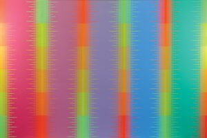
Spectral Complimentaries VII, 1983, acrylic on canvas, 72 x 108 in.
Courtesy of The Estate of Richard Anuszkiewicz © 2021 The Estate of Richard Anuszkiewicz. All Rights Reserved. Licensed by Artists Rights Society, New York, NY at arsny.com
In his Yale master’s thesis, Anuszkiewicz wrote, “An artist must know the rules before he is validly able to break them.” Having left Yale, he was now ready to validly break the rules and emerge into his true self as an artist. Thinking about a possible art-teaching career, he spent the 1955–56 academic year getting an education degree at Kent State University in Ohio while painting furiously—more than he ever had at Yale—in a new mode, which was essentially the one that he stayed with for the rest of his life. In the spring of 1957 he moved to New York, where he got a job repairing plaster models of ancient Greek temples at the Metropolitan Museum of Art. Meanwhile he was taking his new paintings around to the galleries and being rebuffed. It was still the heyday of Abstract Expressionism, and Anuszkiewicz’s work didn’t look like anything else that was hanging on the walls. “My things were very hard-edged, very strong in color—a use of color that nobody else was using,” he recalled. “Everybody would say, ‘Oh, they are nice, but so hard to look at. They hurt my eyes.” That complaint—that the close juxtaposition of pairs of complementary colors (such as red and green or orange and blue) is almost physically painful to look at—would crop up later during the media furor over Op Art.
He finally broke through in the fall of 1959 when The Contemporaries Gallery on upper Madison Avenue agreed to take him on. The director, Karl Lunde (later to be the author of a very valuable monograph on Anuszkiewicz) gave him his first one-man show in March 1960. For the first two weeks, nothing sold, and things were looking bleak. Maybe New York really wasn’t ready for Anuszkiewicz’s eye-challenging paintings. Then one day, right before the exhibition was due to close, into the gallery walked none other than Alfred Barr, the director of the Museum of Modern Art. He walked out with Fluorescent Complement, purchased for the museum. Soon other paintings sold, the buyers being such heavy hitters as New York Governor Nelson Rockefeller and bestselling author James Michener. Anuszkiewicz, only 30 years old, had arrived. He would never again have to work at anything other than his own art to make a living. That same year, he married Elizabeth (Sally) Feeney, a schoolteacher, to whom he would remain married until his death at the age of 89 on May 19, 2020.
Anuszkiewicz had another successful solo show at The Contemporaries in 1961, and then was chosen for inclusion in two important museum shows—“Geometric Abstraction in America” at the Whitney in 1962 and the MoMA exhibition “Americans 1963” the following year. The former covered a lot of ground, from Marsden Hartley through to Alexander Calder, Albers, and Ellsworth Kelly. The latter, a smaller show of 15 contemporary painters, was dominated by Anuszkiewicz, who got the most mention in reviews. All of this set the stage for the 1965 MoMA show that would launch Op Art upon the world, “The Responsive Eye.” The Ab-Ex era had pretty much come to a close, and the time was ripe for harder-edged, emotionally cooler styles, including Pop and Minimal art. “The Responsive Eye” was a very broad show—123 paintings by 100 international artists—and can certainly be faulted for trying to tie too many things together without enough historical context. Nonetheless, it was one of the most successful modern art exhibitions ever in terms of sheer media attention and popularity with the public.
Whether there ever was a movement called Op Art is up for debate even now. The MoMA show positioned the older artists Albers and the Hungarian-French Victor Vasarely as progenitors of Op, but Anuszkiewicz was in no sense a disciple of Vasarely and had developed his abstract style independently of Albers, despite having been his student. The young English artist Bridget Riley, widely considered the greatest practitioner of Op alongside Anuszkiewicz, worked entirely in black and white and had evolved her style independently. The term Op Art, a semi-humorous play on Pop Art, was introduced by the critic Brian O’Doherty in a Time magazine article that actually appeared a few months before “The Responsive Eye” opened. His article was subtitled “Pictures that Attack the Eye,” and this notion of violent assault by color became ingrained into virtually any discussion of Op at that time and since.
Of course the notion, like most notions, was nothing new; think of John Ruskin accusing James Whistler of “flinging a pot of paint in the public’s face” back in 1889. This time, though, the charge was rooted in perceptual issues. It is true that something special occurs when complementaries are placed closely together; the retina, the optic nerve, and the vision centers in the brain experience unusual and, to some, unsettling reactions. Briefly put, an effect of apparent movement is created, as if the colored forms were vibrating within the picture. Seurat and Signac had already exploited this property in their Divisionist paintings decades earlier, using it to create a shimmering effect intended to mimic the real-life behavior of light. But Anuszkiewicz had a different intention—to show the viewer something about how he or she perceives color, and to reveal the potential energy inherent in color. His abstract paintings from the very early ’60s used two colors to create repeating forms that seem to interchange with each other; for example, green plus signs arranged in a circular pattern on a red background that give way to red plus signs on a green background (Plus Reversed). This approach is also a way of subverting the figure-ground distinction that much of Western art is based upon.
By the mid-’60s, Anuszkiewicz’s work had become more linear, with a strong emphasis on the square. Using contrasting borders, squares within squares both congruent and tilted 90 degrees, two triangles within a square, and a truly astonishing variety of color combinations, he showed that the square was anything but a simple form. He spoke of unlocking the hidden secrets of the square, and as his work developed, he did so in an ever-increasing number of ways. Toward the end of the ’60s, he expanded the concept of squares within squares to create grids, and the resulting paintings seem almost like series within one work. In a way, this approach holographically recapitulates Anuszkiewicz’s entire oeuvre, which in its consistency and organic growth can be considered as one complete series.
In the ’70s his colors became a little darker and more mellow, and rectangles appeared within the squares and then on their own. A trip to Egypt in 1981, during which the Anuszkiewiczes visited the Valley of the Kings, led to a particular role for the rectangle in what came to be called the “Temple” series. Within a slightly rectangular vertical frame, several tall, thin rectangles are placed side by side, surrounded by fine lines radiating outward. There is always an odd number of these thin rectangles, usually three or five, so that one is right in the center of the composition. Anuszkiewicz had sometimes referred to himself as the “architect” of his paintings; now he was evoking architecture in a rare concession to figuration, albeit very abstracted. The paintings suggest the rows of columns of an ancient Egyptian temple, through which light may radiate at a certain time of day. Certainly there is something otherworldly and even spiritual about these “Temple” paintings, several of which were titled in homage to artists Anuszkiewicz admired—for example, Temple to Albers and Temple to Mondrian. In making these works, the artist may also have been thinking of the architectural models of classical Greek temples that he touched up as a Metropolitan Museum employee back in the late ’50s.
Within the confines of his special program, Anuszkiewicz never stopped innovating. In the late ’80s and into the ’90s, he forsook flatness for the realm of the illusionistic third dimension, causing his squares and other forms to seemingly interpenetrate and wrap around each other. In these paintings, the thin lines get a little thicker and start to look almost like shading. Whatever the specifics, though, color and form remain the subject matter, existing in an imaginative space that invites the viewer to enter and leave behind his or her everyday life of unexamined perceptions.
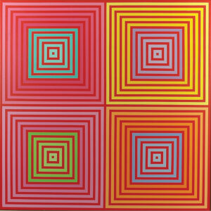
Four on Four, 2013, acrylic on canvas, 60 x 60 in.
Courtesy of Loretta Howard Gallery © 2021 The Estate of Richard Anuszkiewicz. All Rights Reserved. Licensed by Artists Rights Society, New York, NY at arsny.com
Anuszkiewicz’s art has been criticized on the grounds that it is not only “painful to look at” but also emotionally lacking. Typical of these opponents was Hilton Kramer, who wrote, “The victories [Anuszkiewicz’s paintings] win over the spectator’s visual attention are technically brilliant but expressively empty. Like many lesser votaries of optical painting, he forfeits the finer shades of feeling for surface effects. His virtuoso mastery of these effects remains impressive, but it is meager compensation for the emotional void that motivates it.” The problem with Kramer’s critique is that it defines emotion too narrowly. There is plenty of emotion in Anuszkiewicz’s work—the emotion of intense enthusiasm for color, the evident joy of the artist as he combines colors and forms, and the effect that colors inevitably have on the emotional state of the viewer. Anuszkiewicz’s way of expressing himself in words had a careful mathematical and scientific quality about it, but he acknowledged the role of feelings in an interview: “I try to manipulate [color] in schemes that give the viewer a particular feeling of excitement. If you want to call it emotion, that’s fine.”
As for the charge that Anuszkiewicz’s paintings hurt the eyes, that is patently untrue. They excite the eyes; they stimulate them in new and unfamiliar ways, and that unfamiliarity may be experienced as pain by those who are ill-prepared for the experience. Perhaps the eyes of the early and mid-’60s were more inclined than ours to be hurt by complementary color effects, but today, the works of Anuszkiewicz give pleasure, not pain.
And with the perspective that comes with time, we can see him now not as the most skilled of a group of artistic pranksters who sought to dazzle and jangle the optic nerves of a bemused public, but as an heir to a long Platonic tradition of art extending from the Renaissance through Kandinsky and Mondrian and many others in the modern era, a tradition that turns away from the appearances of everyday life and toward the everlasting, beautiful, and soul-satisfying truths of pure shape, number, and color.

Subscribe to Art & Antiques for your Digital or Print copy