Subscribe to Our Newsletter
Striking a Balance
As her relationship with painting evolved, Springford’s style became ever more original
By Cayla Blachman
Vivian Springford (1913–2003) has earned an almost mythic reputation in the art world today. Often recalled as a 1932 New York City debutante, she has long evaded consideration as a serious artist.
Born in Milwaukee, Springford was transplanted as a teenager in 1930 to New York City, where she attended the prestigious Spence School. After graduating, she turned away from high-society tradition to pursue an education in the arts at the Art Students League of New York. She continued her studies at the League for 14 years, developing a strong academic background in drawing and painting. During this time, she pursued a traditional artist’s career, producing oil portraits for private clients and illustrations for publications.
Rice Paper Mounting, c.1962-1963. Acrylic on rice paper mounted on canvas, 24 x 47 1⁄2 in.
©2023 Vivian Springford Archive
By the 1940s, a shift occurred both for Springford and the larger art scene in New York City. She left the Art Students League in 1946 and situated herself among some of the greatest names in American painting of the 20th century. Artists like Jackson Pollock—just one year ahead of Springford at the League—had begun creating a new genre of Abstract Expressionism, one later coined “Action Painting” by art critic Harold Rosenberg, who also happened to be a close friend of Springford.
With the rise of Abstract Expressionism also came the elevation of the artist to almost a celebrity status, a trend that would continue throughout the latter half of the 20th century. Not so much demure as humble, Springford shied away from this path, focusing on her artistic development. It was during this time that Springford’s work, too, changed markedly, as she abandoned her figurative work and pastel color palette. However, she is often misplaced in this movement with her contemporaries, as her move toward abstraction investigated other worlds entirely. Springford did run within these circles, though, befriending artists like Sam Francis who were essential to the development of her own oeuvre. Her participation in this creative culture allowed for a significant evolution from her days of portraiture and illustration to more carefully considered and abstracted work.

Scuba Series, c.1978. Acrylic and collage on paper, 30 x 22 in.
©2023 Vivian Springford Archive
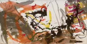
Springford’s Calligraphy Works of the 1950s mark a new era in her career. At first glance, the large-scale paintings call to mind those of Franz Kline made during the same period. Whereas Kline aimed to dissociate his brushstrokes from any objective context, Springford, instead, drew her initial inspiration for these works from “The Brahmin and the Mongoose,” a Hindu folktale from India. These five paintings depict the fury, confusion, and passion represented in the story, which features a woman who rashly kills a mongoose that she had raised as her own. Much like her contemporaries, Springford used paint to convey the complexity of these emotions. She also depicted the action of the event itself; upon closer examination, one might see the foot of the mongoose or even the eyes of a serpent. While the Abstract Expressionists looked inward, Springford chose to work within a larger history both in terms of content and form. “The Brahmin and the Mongoose” works, though abstracted, are not purely abstract.
Formally speaking, Springford drew upon the tradition of Chinese calligraphy to create these works. She sought out her place within this larger history, creating a unique style in the process. Springford’s interest in Chinese art and philosophy is often attributed to her relationship with artist Walasse Ting, her studiomate and a native of China. While her Calligraphy Works did, indeed, coincide with this burgeoning relationship, the interest was all her own, as evidenced by the annotated copies of Confucius and Lao Tzu from her days as a student, found in her personal library. Springford was a well-educated, cosmopolitan woman, so one might also presume that she had explored the Asian Art galleries of The Metropolitan Museum of Art and was attuned to the heightened interest in Asian culture during this period, even without Ting’s influence. The Calligraphy Works are a turning point both formally and philosophically, acting as a springboard for the Chaos series that followed.
The Chaos series illustrates Springford’s further investigation into this way of painting. Separated from as strong a reference as “The Brahmin and the Mongoose,” the paintings do, in fact, feel more gestural. But perhaps this suggestion of ease and action is one of Springford’s greatest achievements. Each painting started with a “sketch” on rice paper, the more active beginnings of a carefully considered artwork. From these preliminary drafts, Springford was able to plan her compositions, add color, and formulate impact. In some sense, Springford did begin with an Action Painting. Rather than commit to this action in and of itself, she then collected the most important moments from the initial act in order to create something far more powerful.

Untitled, c.1959. Acrylic on canvas, 68 x 52.5 in
©2023 Vivian Springford Archive
The early 1960s brought another period of experimentation for Springford. Developing the bold linear language of her Calligraphy Works and Chaos series, Springford took on a new perspective. The aerial perspective was nothing new to painting. Mondrian famously interpreted New York City’s lively grid with Broadway Boogie Woogie in 1943, and Arshile Gorky, a contemporary of Springford, had been a proponent of this perspective in the previous two decades. The aerial perspective allowed for a flattening of aspects of the real world and was perfect for the two-dimensional picture plane. In 1962, Harold Rosenberg published a monograph on Gorky, of which Springford was apparently one of the first readers. It is easy to imagine that Springford similarly peered down from the top of Manhattan’s skyscrapers, or from an airplane window throughout her many travels, eager to translate this way of seeing to a painted surface. With her rice paper mountings of the early 1960s, one sees her calligraphic lines of the past transformed into city streets, dashes of color denoting the life happening in between.
Springford continued to experiment with different methods of paint application while maintaining this way of looking. Her later work is pared down, favoring pools of color over the more graphic brush strokes in her previous work. Veils of various hues overlap and intertwine, creating shapes that are simultaneously organic and constructed. The accumulation of pigment around each shape’s edge forces a consideration of process: the pouring, the layering, and the spatter. Still, these works maintain an air of effortlessness and quietude. They appear simplified, though the effect created is just as complex, if not even more so, as the work that came before. In this body of work, Springford truly honed her craft, birthing the aesthetic now understood to be uniquely Vivian Springford.
This investigation into new forms and color began with a trip to Yellowstone National Park in 1965. There, Springford observed the park’s many hot springs and fumaroles, and the work that follows offers direct representations of these natural phenomena. Her Morning Glory series is unmistakable as the Yellowstone spring by the same name. By delving into new subject matter, she discovered her interests and new ways of representation. These works are not so much a departure from the Calligraphy Works as they are an evolution of them. Compositionally, one can see the similarities, though frenetic brush strokes are replaced by controlled shapes. Both bodies of work embrace elements of chance; however, they do not entirely eschew careful planning and, as such, the skill necessary to execute them. This balance between chance and intention further showcases Springford’s artistry, as she harnesses happenstance in pursuit of a greater plan. With this series, her embrace and simultaneous questioning of abstraction come into play.

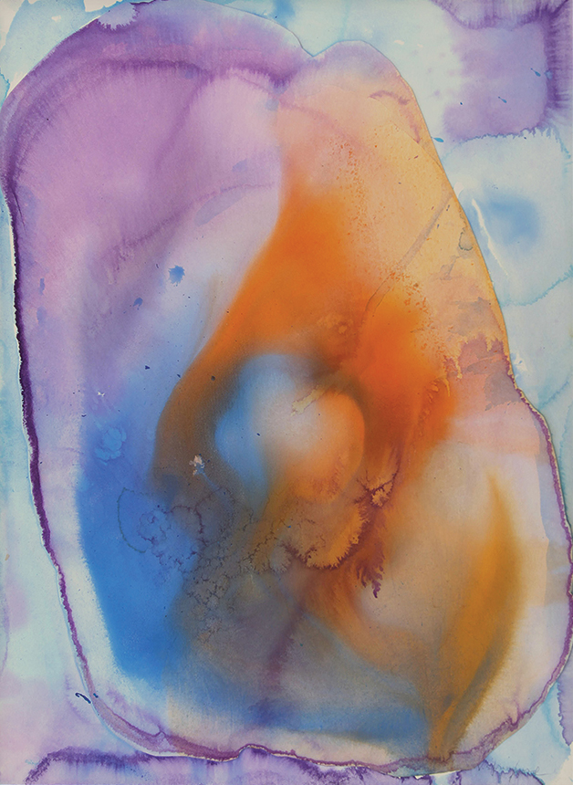
Scuba Series, c.1978. Acrylic and collage on paper support mounted on Dibond, 30 x 22 in.
©2023 Vivian Springford Archive
For the remainder of her career, Springford continued on this path, exploring the possibilities of documenting the natural world. Though the worlds she represented became more distant, Springford always held onto an external referent. The Expansionist series was initially inspired by Springford’s trip to Guadeloupe, where she witnessed the 1977 volcanic eruption of La Grande Soufrière. The Expansionist, Cosmos, and Scuba series, among others, became a catalogue of natural phenomena: volcanoes, coral reefs, or even the nebulas she would have seen in her copy of Burnham’s Celestial Handbook. She continued to look further outward, deeper into worlds unknown.
With her formal training and background, Springford could have simply painted these worlds in a traditional realist manner. Instead, she nearly mimicked the creation of nature itself with her slow pooling and layering of liquid paint, the immediacy of spattered color, and deliberate addition of brushstrokes—a synthesizing of elements that could take up to a decade to complete. It is because of these formal qualities that the works are almost always misclassified as Color Fields. Yet, to identify these works as purely abstract would not be the whole truth. While aesthetically the comparison is tempting, Springford clearly defies categorization as a Color Field painter in her attention to her subject matter. She certainly uses abstraction as a tool; for her contemporaries, abstraction was also the objective. Fields of color may have been a by-product of Springford’s exploration, but the work is not so much a meditation on color as on the natural world. Springford’s interests remained deeply rooted in the physical world, whereas the Color Field painters used abstraction in an attempt to transcend it.
In her inability to fit within categories, Vivian Springford was overlooked by the art world of her time. It is exactly this fluidity, though, that allowed her to create such important work. Rather than give in to the philosophies and techniques of Abstract Expressionism, Springford used their tools to create a category all her own. She struck a balance between abstraction and representation, simulating the natural world not only visually, but in the process of creation, as well. Rather than accepting Abstract Expressionism at face value, she asked what it could do for her and how this new modality of artmaking could further her own interests. Springford looked outside herself—to the natural world, to history, to artistic traditions—amalgamating what spoke to her in order to create something new. She identified this herself, once noting, “Painting is my attempt to identify with the universal whole. I want to find my own small plot or pattern of energy that will express the inner me in terms of rhythmic movement and color.” In this sense, Springford was a master of synthesis, each aspect of her work culled from some greater context. With every distinct style that came from Springford’s hand, one sees a throughline to the next. Vivian Springford’s strength was in her ability to identify her own, continuously evolving, building upon her successes, and innovating on her own terms.

Subscribe to Art & Antiques for your Digital or Print copy